ShopDreamUp AI ArtDreamUp
Deviation Actions


Description
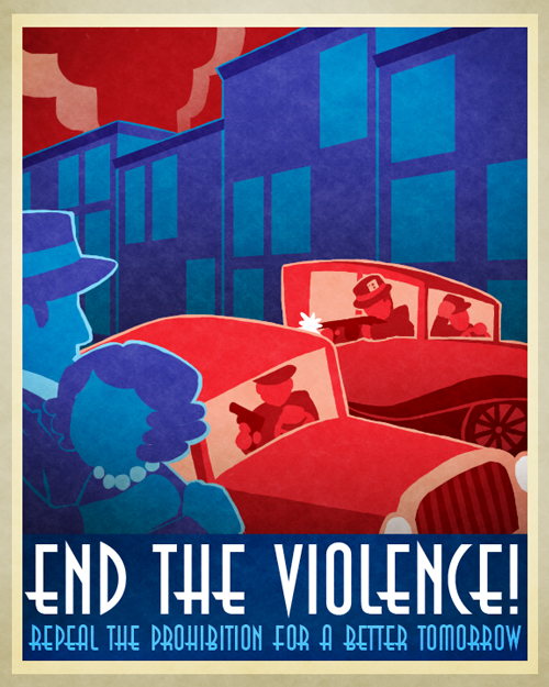
This was my first assignment for my third design class. Basically, the assignment was to create a visual political statement. That's all the directions I got. XD; I didn't know it was supposed to be about a modern situation, but what the heck, I went with it lol.
I decided to go with another art deco-ish illustration you would probably see in the 1920's, so I spent a couple hours looking at some examples. Afterwords, I worked on the bottom banner, then later with the couple in the foreground, the buildings in the background, and the two vintage cars shooting at each other. I've also added some filters to add some texture so it looks old.
I chose to use blue and red as the main colors because they represent two of America's colors, and also that there's a strong relationship between the two. Blue, I believe, represents innocence and sadness, while red represents corruption and anger. The border's just a border lol.
Also, in case you haven't noticed, there's some Lackadaisy references in here. XD The girl on the left is based on Miss Mitzi May, and I guess the guy represents Zib? Or Sedgewick? Maybe? I dunno. There's also a guy in the back car with a card in the band of his hat. Wonder who that could represent? XP
So yeah, that's it. Really like how it turned out, even if it looks more like cut-out art lol.
Image size
500x625px 251.07 KB
© 2011 - 2024 buizelmaniac
Comments25
Join the community to add your comment. Already a deviant? Log In
It's wonderful...it really has an Art Deco feel to it, and 1920s aesthetics. I like it!